Personal Portfolio Website – Wireframes
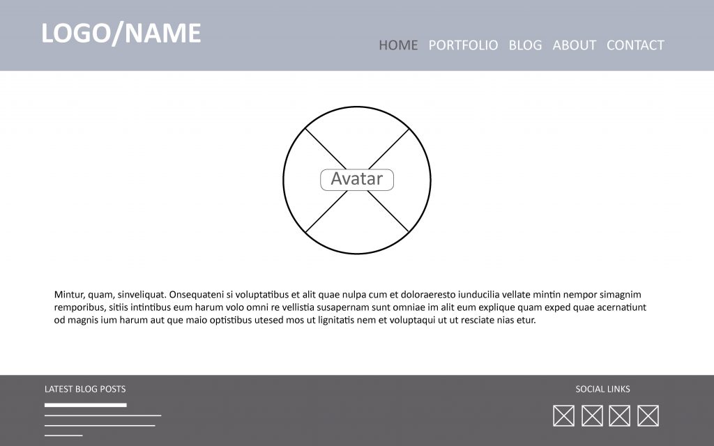
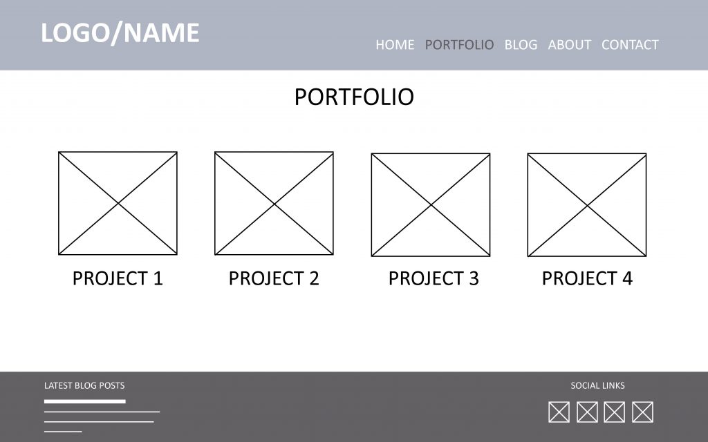
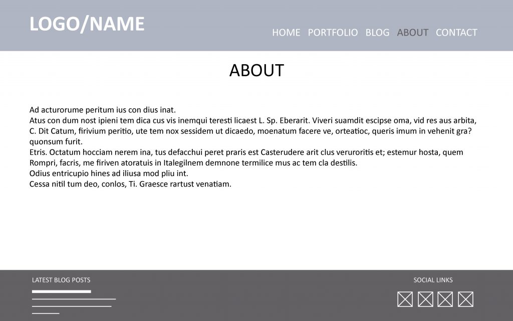
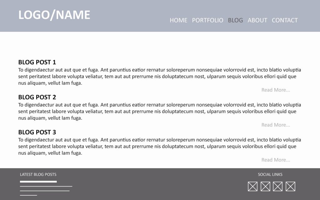
When I first started my career as a creative I realised I needed portfolio website to display my work online. This is the 4th re-design since my first site, which looked very very different. When doing this version I had started building an interest for UI/UX, so I drew up a set of wireframes before I put it together. Although my HTML5 coding skills are pretty good (I find CSS a bit more challenging), I used a basic theme and set it up on WordPress.org. A fair amount of custom code later I made this website look the way I wanted, which is slightly different from my original plans. The most important thing to me was that it would be fully responsive for easy of browsing on all devices, and of course easy to use.
Milos Crafts Website
The latest website I put together was the Milos Crafts Design Studio Website. Milos Crafts is a small craft business on my home island in Greece, Milos. The look and feel is inspired by the Cycladic island where it is based, as well as the sea, so it consists of mostly whites and blues. Like all my websites it is responsive, and I have used bootstrap to make this work perfectly across all devices. This was the first website I’ve had to set up in two languages (English & Greek) which was a challenge, but turn out really well in the end. I helped in the translation of the content, and have designed the Milos Crafts logo (to view my logo designs click here) as well as other promotional material. Unfortunately the Studio is on hiatus at the moment, but you can visit the website at miloscrafts.com.
*Wireframes coming soon!*
AdGrad ’16 Website
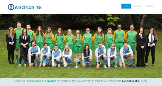
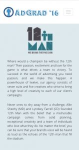
The Pitch is a big part of the DIT MSc in Advertising every year. The class is split into two teams which act as full service agencies while they prepare for the pitch. The promotion of the event is left to the students, who aim to create as much hype around it as possible. Part of this is the AdGrad website which is re-designed each year, and given its own brand according to a theme (during my year it was 80’s Football). Every student helps with tasks they are usually best at, so I took on the website, seen as I had the skills and previous experience.
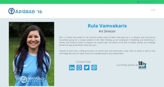
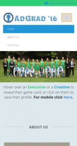
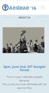
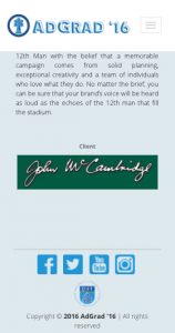
I used Adobe Dreamweaver to put the website together. It was important to me that the website would be responsive, so I used a basic responsive CSS theme and built everything else on that. We decided that when users placed their mouse (hovered) over each face in the photograph on the homepage, we wanted a card to appear, which was designed to look like a retro football card, and when they clicked on each face they would be lead to the person’s profile page. This was tricky to programme but worked really well in the end. However, the ‘hover’ feature doesn’t really work on mobile, so I added a page so that mobile users could access the students’ individual profiles. All other content was in a single-page layout.
Below are some screenshots of the final, working website.
You can check out some of my work on my team’s brief here.

